
Best Kitchen Color Schemes | Latest Color Combinations
The kitchen, often hailed as the heart of the home, is more than just a place to cook. It’s a gathering space, a hub of activity, and a reflection of a household’s personality. Just as the ingredients make a delicious meal, the right color scheme can transform a kitchen from purely functional to truly captivating. Choosing the perfect palette involves understanding not only aesthetics but also the psychological impact of colors and how they interact with light and space.
The Foundation: Understanding Kitchen Layout and Light
Before diving into specific color schemes, it’s crucial to assess your kitchen’s inherent characteristics. The layout, size, and amount of natural light are pivotal in determining which colors will thrive. A small kitchen with limited natural light might benefit from lighter, brighter hues to create an illusion of spaciousness and airiness.
Conversely, a large kitchen flooded with sunlight can handle deeper, more saturated tones without feeling overwhelming. Consider the existing fixed elements like flooring, countertops, and appliances, as these will form the backdrop against which your chosen colors will play. Undertones in these existing elements – warm or cool – can guide your selection of wall, cabinet, and accessory colors, ensuring a cohesive look.
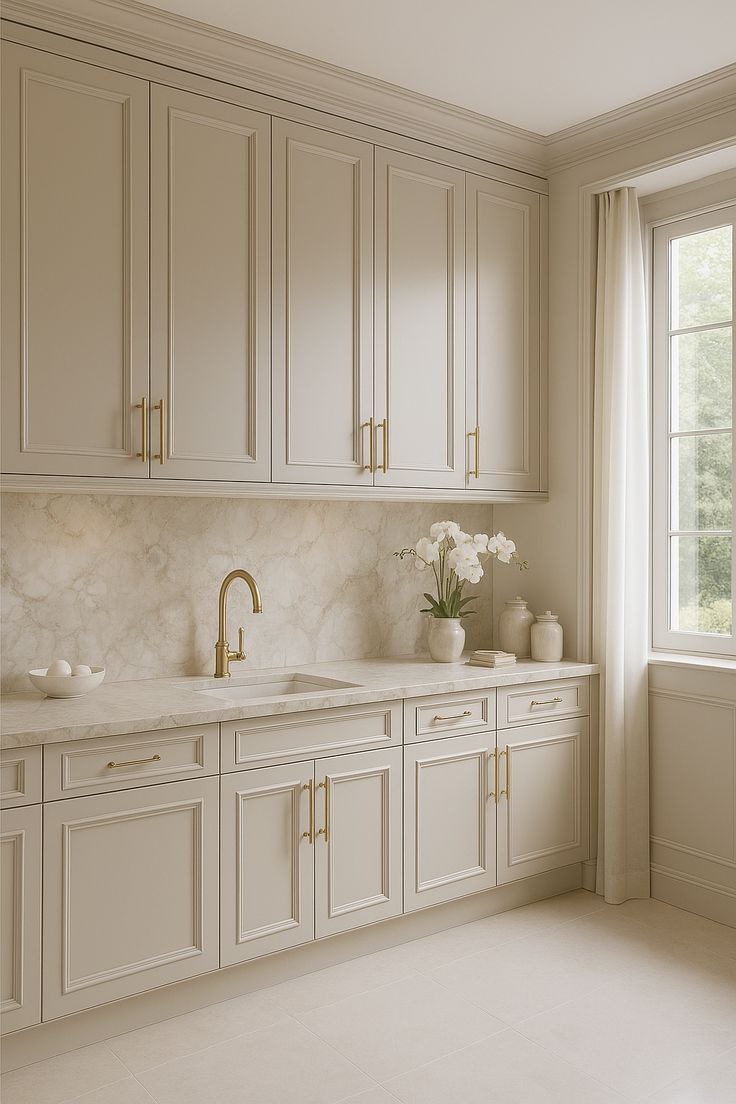
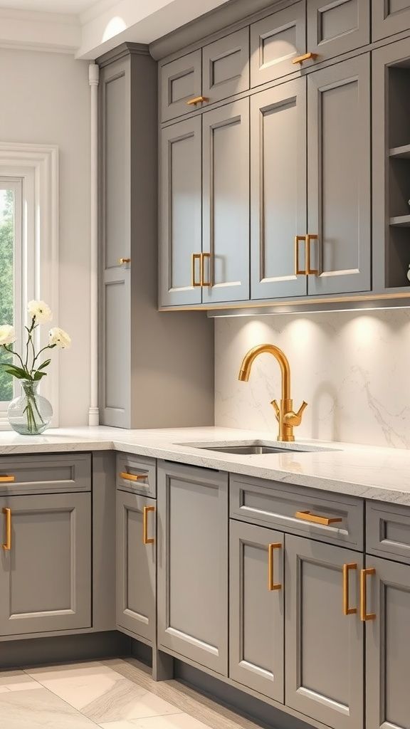
Classic and Timeless: White, Gray, and Wood
For those seeking enduring elegance and versatility, the classic combination of white, gray, and wood remains an undeniable favorite. White kitchens exude cleanliness, brightness, and a sense of fresh simplicity. They act as a blank canvas, allowing other elements like unique backsplashes, colorful appliances, or vibrant accessories to truly pop. However, an all-white kitchen can sometimes feel sterile; this is where gray and wood come into play.
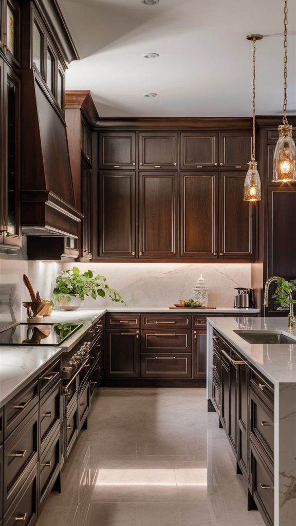
Gray, in its myriad shades from charcoal to dove, offers sophistication and depth without being overly dominant. It pairs beautifully with white, adding a subtle contrast and a touch of modern sensibility. Warm grays can complement natural wood tones, while cooler grays can lean into a more contemporary or industrial aesthetic.
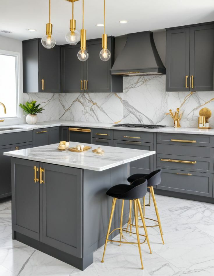
Wood, whether in cabinetry, flooring, or open shelving, injects warmth, texture, and an organic element that grounds the entire scheme. Light woods like maple or birch maintain an airy feel, while richer tones like walnut or cherry add a touch of traditional luxury. This triumvirate creates a kitchen that is both timeless and adaptable, easily updated with changing trends through simple accessory swaps.
Warm and Inviting: Earth Tones and Mediterranean Hues
To evoke a sense of comfort, hospitality, and a connection to nature, warm color schemes are an excellent choice. Earth tones such as terracotta, olive green, muted oranges, and deep browns create a cozy, grounded atmosphere. These colors are reminiscent of sun-drenched landscapes and natural materials, making the kitchen feel welcoming and lived-in.
Mediterranean-inspired palettes take this warmth a step further, incorporating vibrant blues, sunny yellows, and rustic reds alongside more subdued earthy tones. Think of the whitewashed walls of a Greek island home complemented by cobalt blue accents, or the rich ochres and terracotta tiles of an Italian villa.
These schemes often pair well with natural stone, wrought iron, and distressed wood finishes, enhancing the authentic, old-world charm. Such color choices are perfect for kitchens where entertaining and family gatherings are central, fostering a convivial and relaxed ambiance.
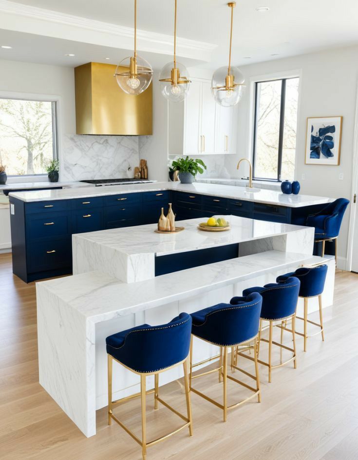
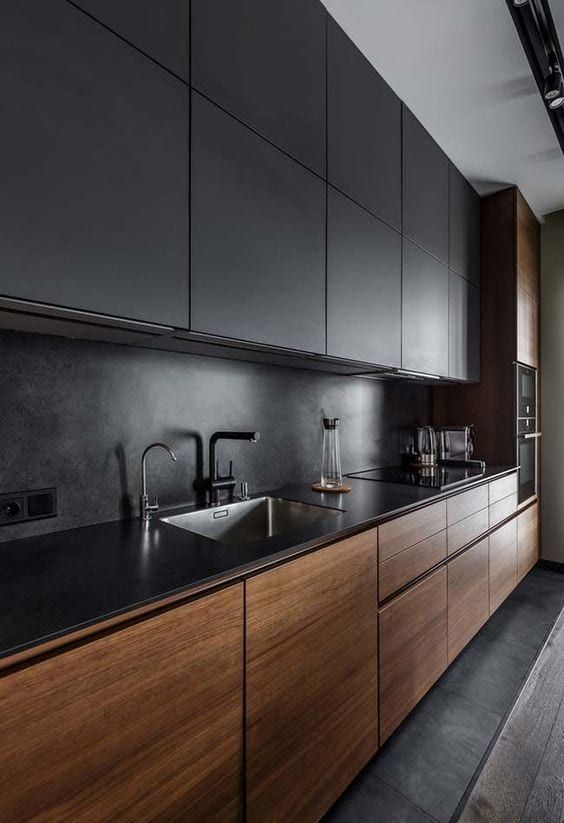
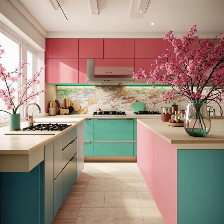
Bold and Contemporary: High Contrast and Statement Colors
For the adventurous homeowner who isn’t afraid to make a statement, bold and high-contrast color schemes offer a dynamic and modern aesthetic. This approach often involves pairing a strong, vibrant color with a neutral backdrop, or combining two contrasting bold hues. Think sleek black cabinets against crisp white walls and a bright red backsplash, or deep navy cabinetry paired with brass accents and a marble countertop.
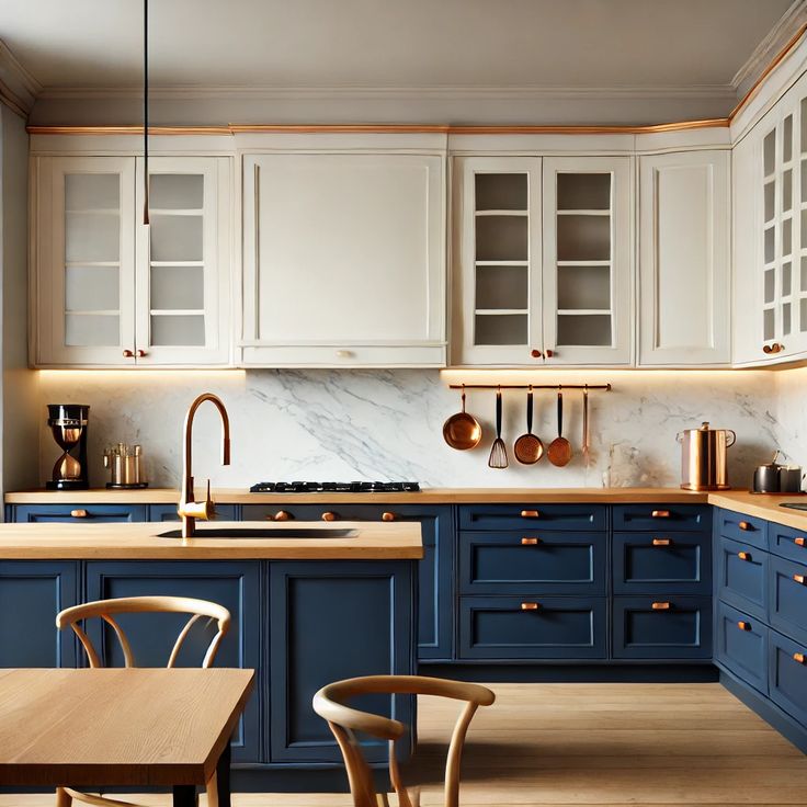
Popular choices for statement colors include emerald green, sapphire blue, vibrant yellow, or even a sophisticated plum. These colors can be applied to full cabinetry, an accent island, or even just a feature wall to create a focal point. When using bold colors, it’s crucial to balance them with sufficient neutral elements to prevent the space from feeling overwhelming. Strategic lighting, reflective surfaces, and thoughtful accessorizing can further enhance the contemporary feel, making the kitchen a true showstopper.
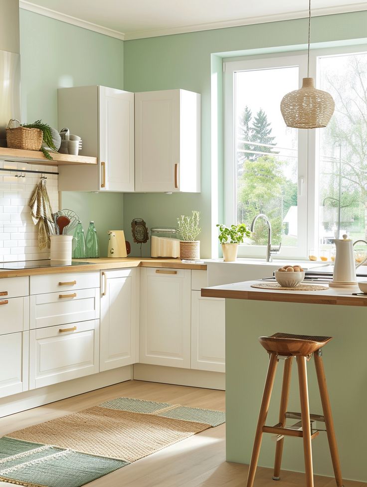
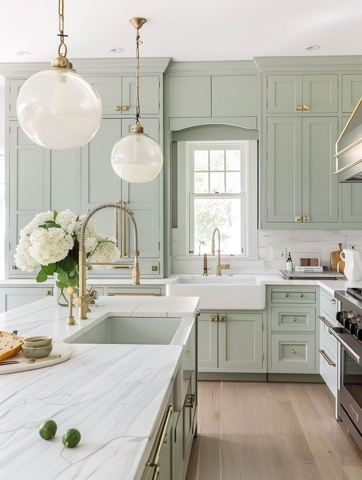
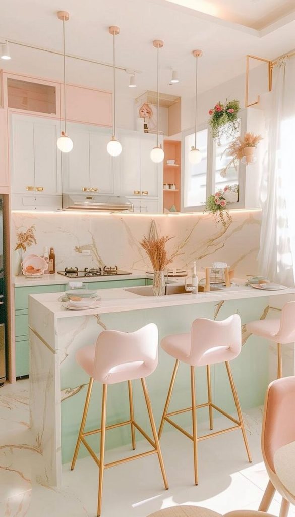
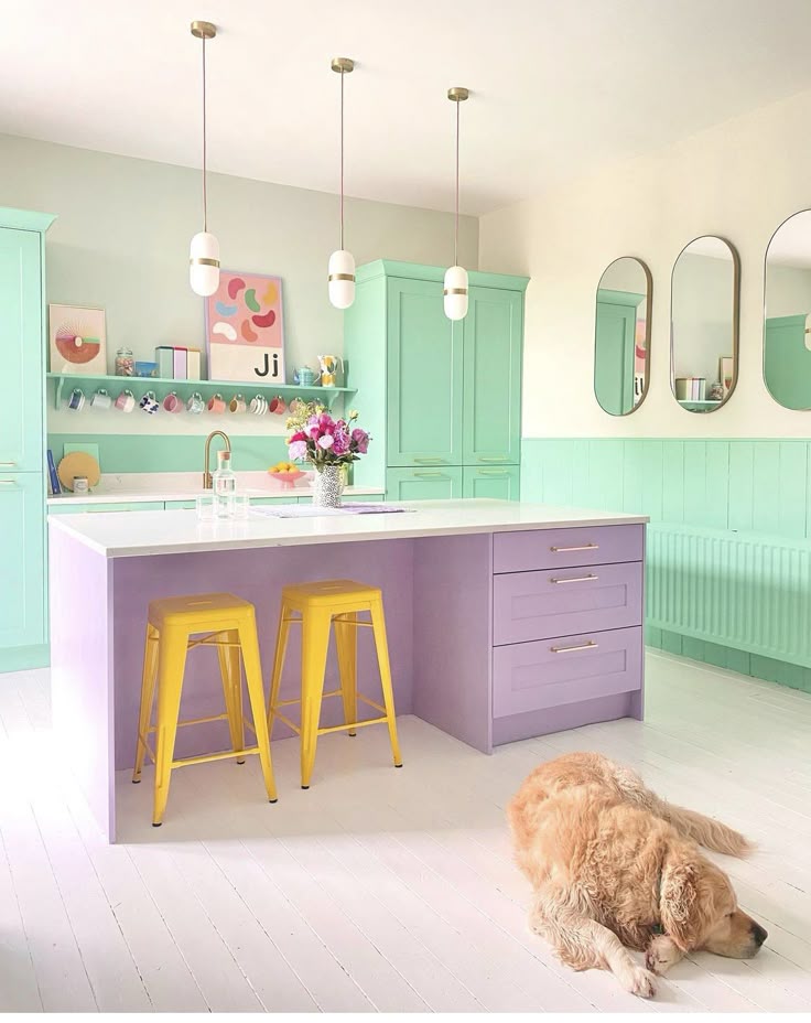
Serene and Calm: Cool Tones and Pastels
If your vision for a kitchen is a tranquil oasis, cool color schemes and pastels are your allies. Shades of blue, green, and lavender inherently evoke a sense of calm, freshness, and cleanliness. Light blues can create an airy, expansive feel, reminiscent of the sky or sea, perfect for fostering a peaceful cooking environment. Mint green or sage green bring a touch of nature indoors, promoting a soothing and harmonious atmosphere.
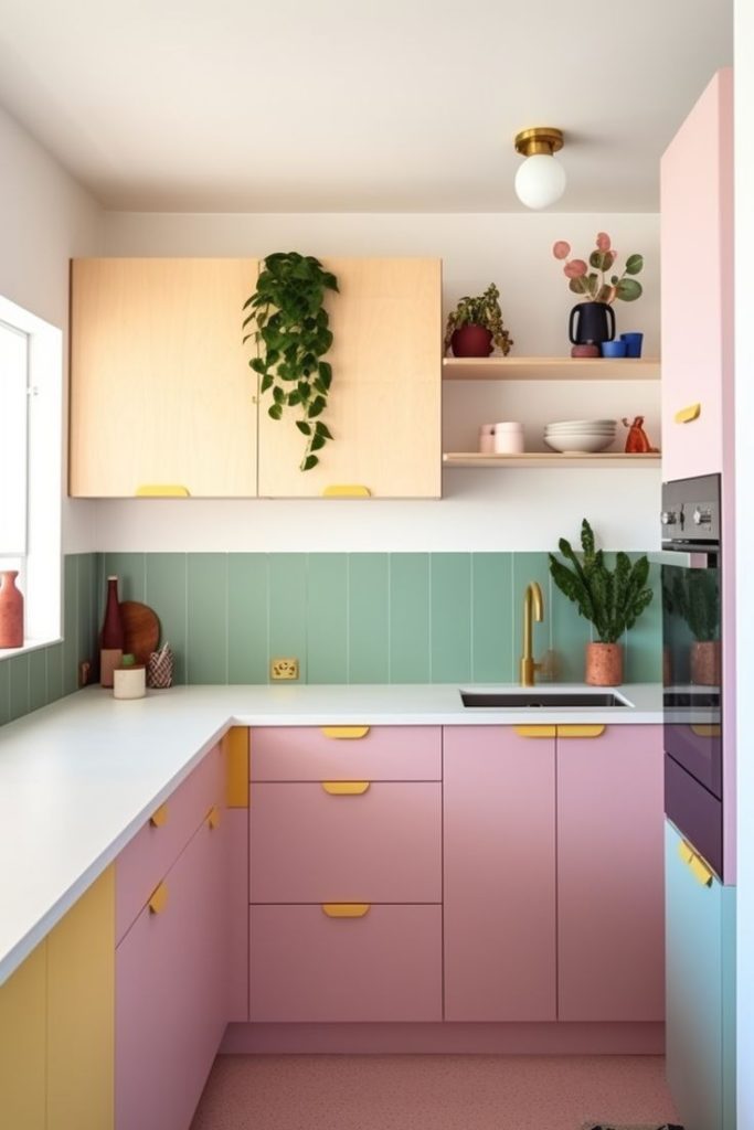
Pastel shades – soft pinks, gentle yellows, and muted peaches – can add a subtle touch of warmth and charm without being overpowering. These colors are particularly effective in kitchens aiming for a farmhouse chic, shabby chic, or Scandinavian aesthetic.
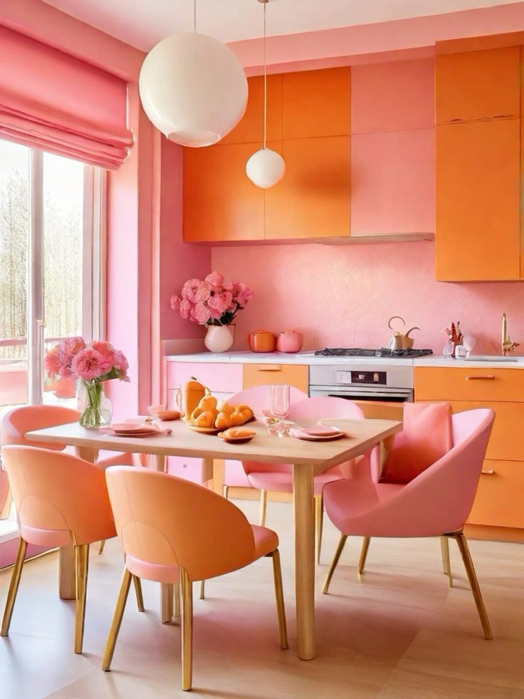
They pair beautifully with light woods, white appliances, and natural textures. To prevent a pastel kitchen from feeling too saccharine, incorporate elements of contrast through darker hardware, a rustic wooden island, or metallic accents. The overall effect is a bright, uplifting, and incredibly serene space.
Integrating Existing Elements: The Unsung Heroes
Expand on how to work with fixed elements like countertops, flooring, appliances, and cabinetry material. Discuss how their inherent color and undertones can influence or dictate your new color scheme, providing examples of good and bad pairings.
The Role of Accents: Bringing it All Together
Regardless of the primary color scheme chosen, accents play a critical role in pulling the entire look together. Hardware (knobs, pulls), light fixtures, small appliances, dishware, and decorative items all offer opportunities to introduce pops of complementary or contrasting color. Metallic accents, whether warm brass, cool chrome, or industrial matte black, can significantly influence the overall feel of a kitchen. A splash of bright color in a stand mixer, a vibrant rug, or a collection of colorful cookbooks can invigorate a neutral scheme.
Conversely, in a boldly colored kitchen, neutral accents can provide visual relief and balance. Think about the interplay between matte and glossy finishes, smooth and textured surfaces, and how these elements contribute to the overall tactile and visual experience of the space.
Ultimately, the best color scheme for your kitchen is one that resonates with your personal style, enhances the functionality of the space, and makes you feel happy and comfortable within its walls. By considering the interplay of light, layout, and your desired mood, you can craft a kitchen that is not only beautiful but also a true reflection of your home’s heart.